Frequently Asked Question (FAQ) pages (or informational hubs) enable your business to respond, react, and anticipate the needs of your audience more quickly and appropriately than other types of destination page experiences.
An effective FAQ resource can educate, inform, and naturally guide the user through your website’s content and toward the goals and results you have set.
Over the years, the role of the FAQ page has changed substantially, and now an FAQ page is an essential webpage to have on your site.
Why An FAQ Resource?
Firstly, FAQ pages can bring new visitors to your website via organic search and drive them quickly to related pages – most typically deeper blog pages and service pages closely related to the questions being resolved.
Next, one of the most significant opportunities for impactful brand visibility within the search engine result pages (in-SERP) is targeting audience questions, wants, needs, and pain points.
The FAQ page is one of the best ways to help people visit your site and get snippets of answers in front of users before they click any results within the search pages.
A helpful FAQ page (more likely an FAQ hub of core pages and topical intent) shortens the time it takes for people to solve their search requirements.
The experience from the first visit to conversion is also faster because you remove any possible barriers to knowledge (informational and often trust).
As a company, you are showcasing expertise through FAQs, plus introducing your key staff, knowledge, and unique insights into the industry sooner.
You add credibility and value through meaningful content in the many forms your audience requires. This will typically include audio, visual/video, and layering of content types now, compared to traditional text-only content provision.
You are also servicing the need for offline conversation and experience through faster and always available online mechanisms.
People will always seek help and advice. They are unwilling to pick up the phone, walk into a store, or wait hours (even minutes) for that information or insight to become accessible.
It needs to be available now and in the format they enjoy the most.
Why FAQ Pages Are A Priority
FAQ pages continue to be a priority area for SEO and digital marketing professionals.
An FAQ page is one of the simplest ways to improve your site and help site visitors and users.
Your FAQ section should be seen as a constantly expanding source of value provided to your audience. It is a place where their ever-changing and growing requirements are not only met but anticipated and exceeded frequently.
In no small part, the importance of FAQ pages has been driven in recent years by the growth in voice search, mobile search, and personal/home assistants and speakers.
These predominantly rely on the pre-results (Google Answers and Featured Snippets) and can be explicitly targeted with FAQ pages.
People need conversation, comparison, and support for most of their decision-making online and offline; FAQs can cater to them all.
An effective FAQ page seeks to:
- Reflect and respond to your audience’s needs wholly and thoroughly.
- Cover a broad range of intent (transactional, informational, locational, etc.).
- Stay updated based on new insights from your data, the industry, and broader best practices.
- Land new users to the website by solving problems and supporting return visits with regular additions and valuable expertise sharing.
- Drive internal pageviews to other important pages and support key conversion paths.
- Fuel blog (and deeper content) creation logically and intuitively ties together semantically relevant content.
- Shine a light on expertise, trust, and authority within your niche, giving your brand and key staff a platform to educate, inform, and support your community.
25 Of The Best Examples Of FAQ Pages
Now let’s look at 25 great examples of FAQ pages/resources and why they’re so effective.
1. Twitter
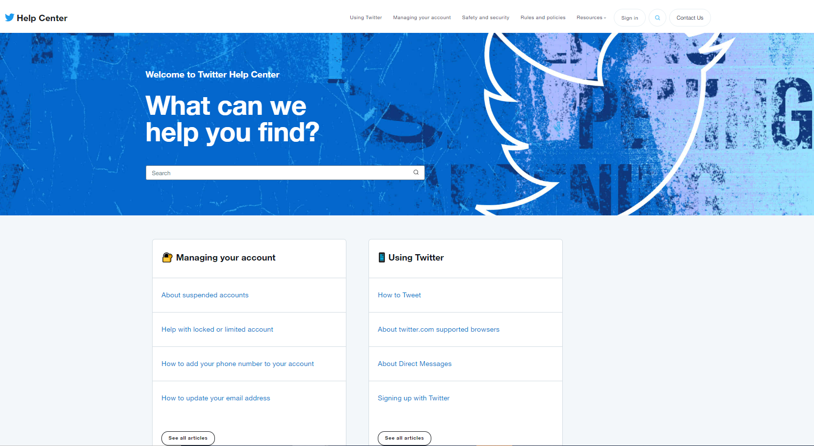
Twitter’s FAQ help center made a list as it factored in some fascinating personalization, easy-to-use search functionality, and has a positive user experience (something few FAQ pages ever achieve).
 Screenshot from Twitter, July 2022
2. YouTube
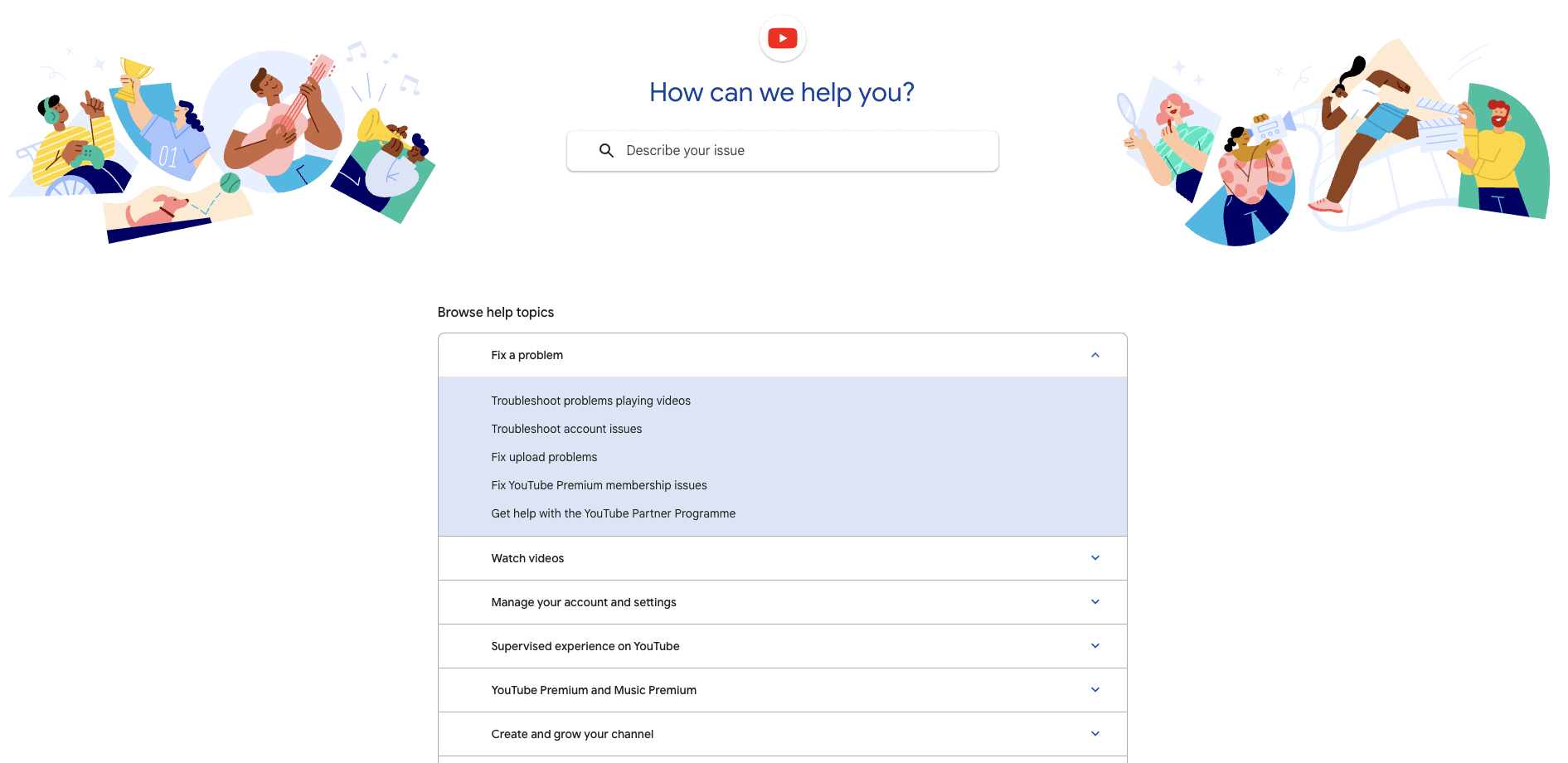
YouTube’s FAQ page is clean, fresh, simple to use, and provides access to the most commonly asked “help” topics.
As you might expect, content delivery combines video/visual content with standard textual content. The role of mixed content types in FAQ pages is something often overlooked.
 Screenshot from YouTube, July 2022
3. McDonald’s
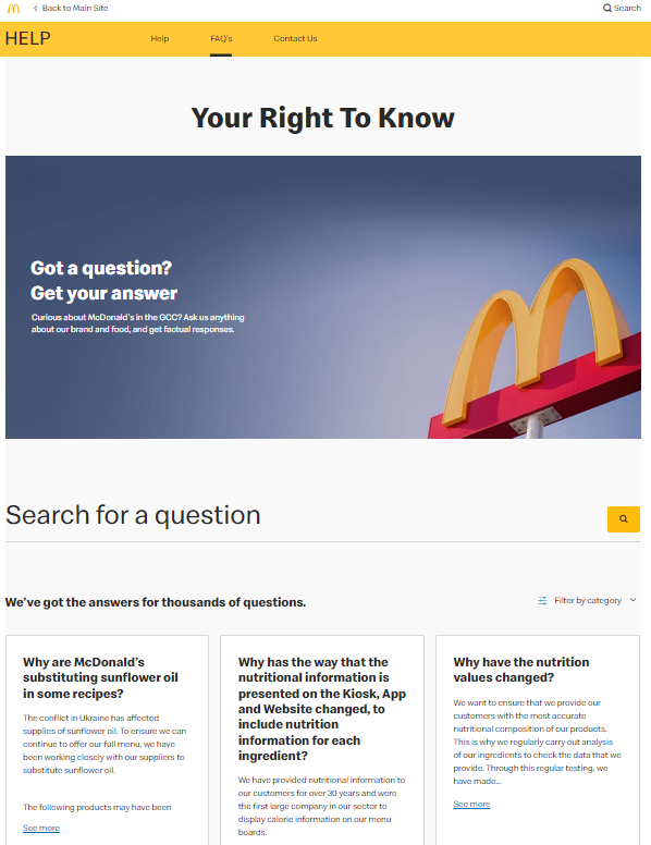
The McDonald’s FAQ page feels informal and sociable, encouraging people to share their FAQ experiences (a rarity).
 Screenshot from mcdonalds.com, July 2022
4. WhatsApp
The FAQ resource for Whatsapp is bright, easy to use, and categorized effectively for quick desktop or mobile use.
When considering the functional role and practical requirements of an FAQ resource, it can be easy to forget the importance of loading time and speed of access to information.
 Screenshot from faq.whatsapp.com, July 2022
5. Wikipedia
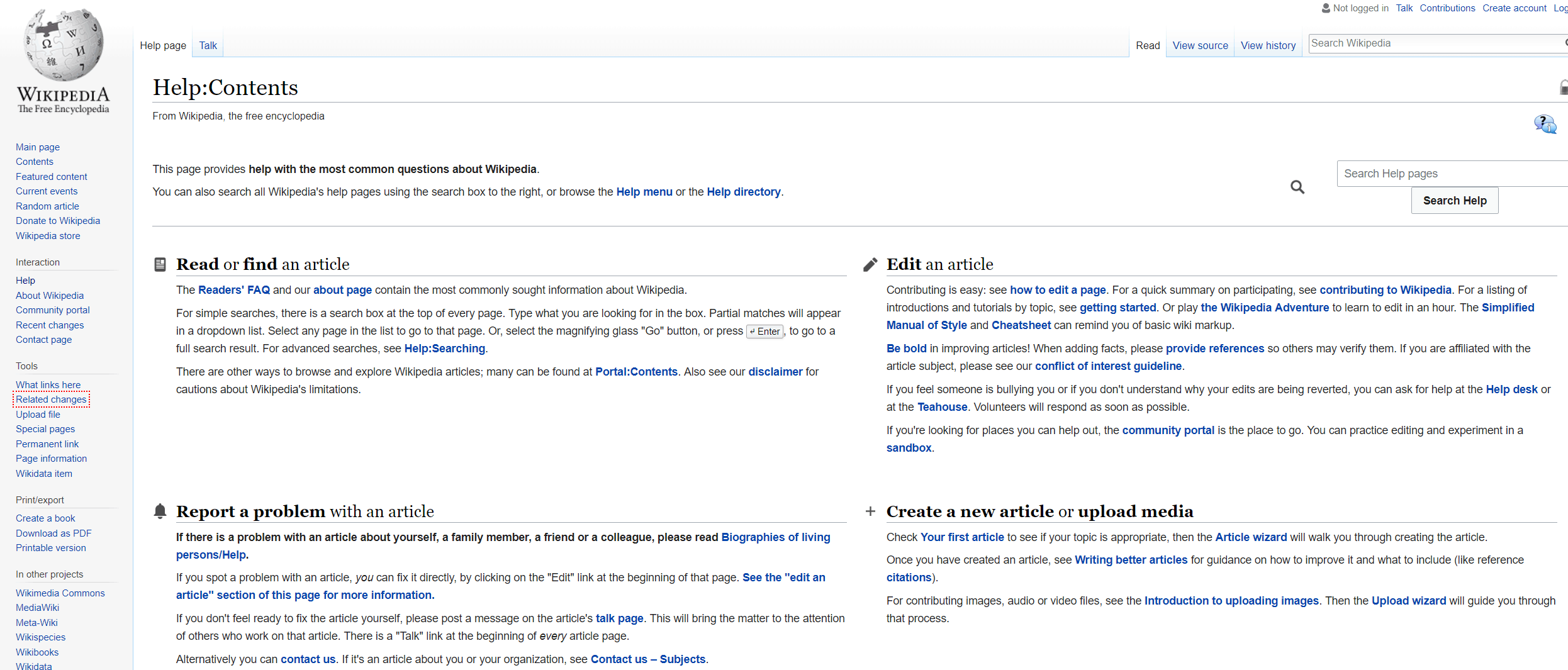
Wikipedia’s help center is an excellent example of an “old-school” FAQ page.
It is text-heavy, blocked into key topic areas, and has extensive access to all the critical support areas you could ever need.
There is something necessary, meaningful and nostalgic about FAQ-orientated websites like this, plus they are hugely helpful and remain more than fit for purpose.
 Screenshot from en.wikipedia.org, July 2022
6. The University of East Anglia (UEA)
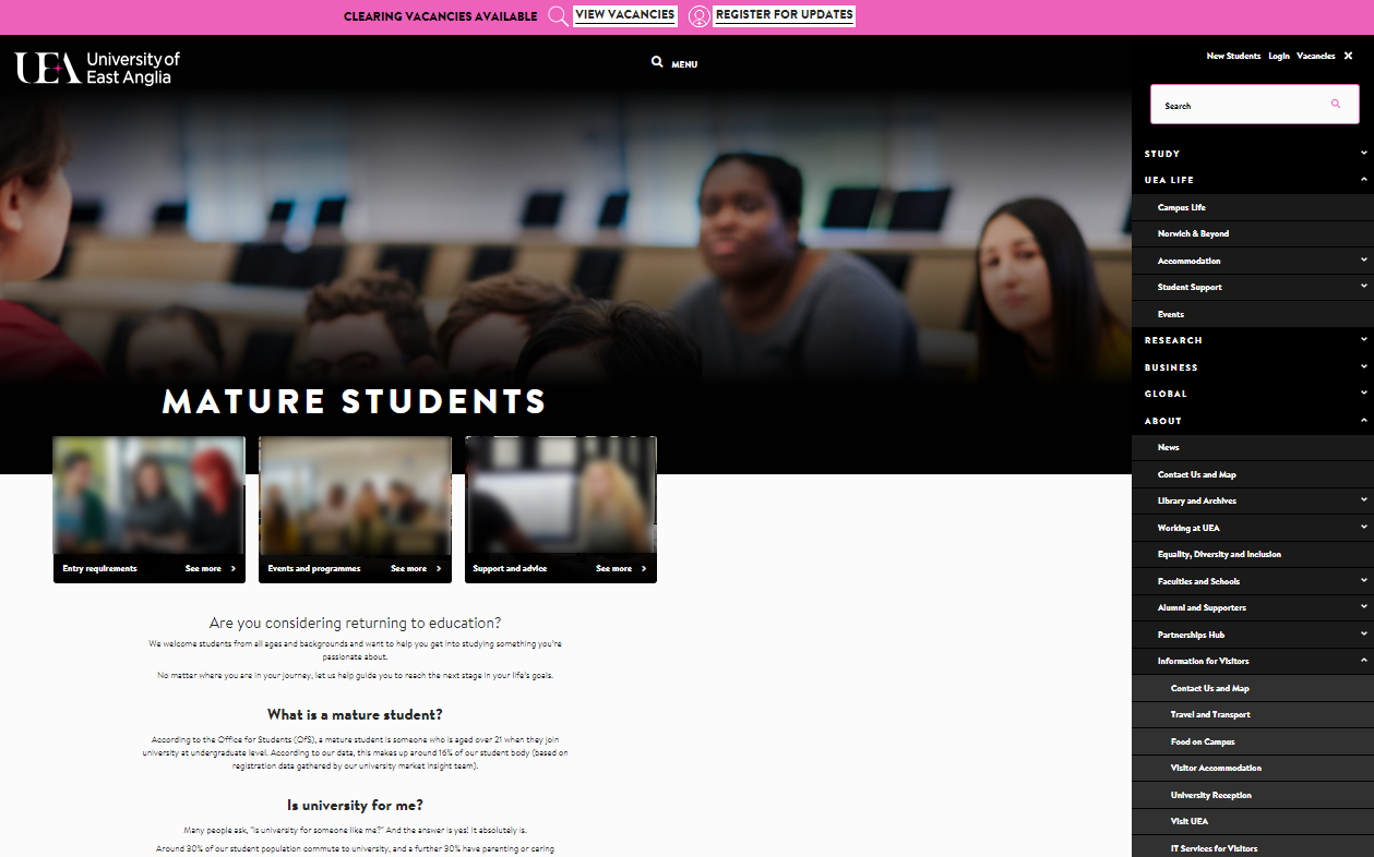
The University of East Anglia FAQ resource is more of an inbuilt problem-solving informational architecture than a separate FAQ resource.
This type of audience understanding throughout every critical section and site navigation reflects the potential to continuously service and support your audience as a core part of the business positioning.
 Screenshot from uea.ac.uk, July 2022
7. UCAS
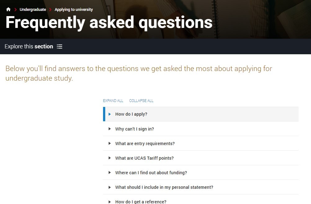
The FAQs section of UCAS is simple, scaled back, and concise.
It includes a prompt to ask if the information was helpful and to gather user feedback to improve the resource.
This type of first-party/direct user feedback loop is excellent as it demonstrates a willingness to refine and improve the FAQ section iteratively.
 Screenshot from ucas.com, July 2022
8. Foresters Friendly Society
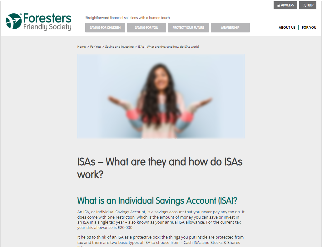
The Foresters Friendly Society FAQ page example showcases topic-specific FAQ content clusters or hubs in action.
This facilitates a quick and effective experience for people to explore topics in detail that matter to them the most, without the added clicks or distractions of single-stop (all-topic) FAQ destinations.
 Screenshot from forestersfriendlysociety.co.uk, July 2022
9. Ontrack
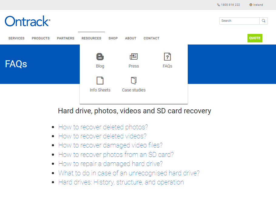
The standout features of the Ontrack FAQ section include the simplified user experience and bold, functional (dialed back) access to crucial information.
The content isn’t cluttered, it’s easy to skim read, plus you can switch between FAQ-related resources within a single click to service various layers of user intent.
 Screenshot from ontrack.com, July 2022
10. DaysOutGuide
DaysOutGuide’s frequently asked questions resource incorporates tags to make the most out of single-click functionality for all device access to information.
The balance between text, images, and interactive features works well.
Content segments are demarked and intuitive.
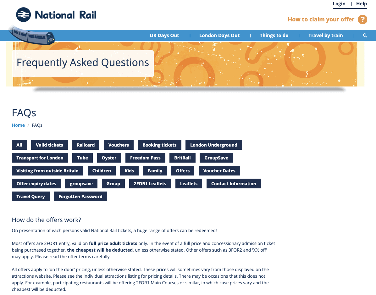 Screenshot from daysoutguide.co.uk, July 2022
11. SendInBlue
SendInBlue’s FAQs are by far the most basic by design (single grid defined by thin square design categories) included in this list of my best and most effective FAQs, but they work.
It’s a simple solution but almost always overlooked.
This offers a helpful reminder that it is the content value and ease of access to information instead of over-design when it comes to effective FAQ pages.
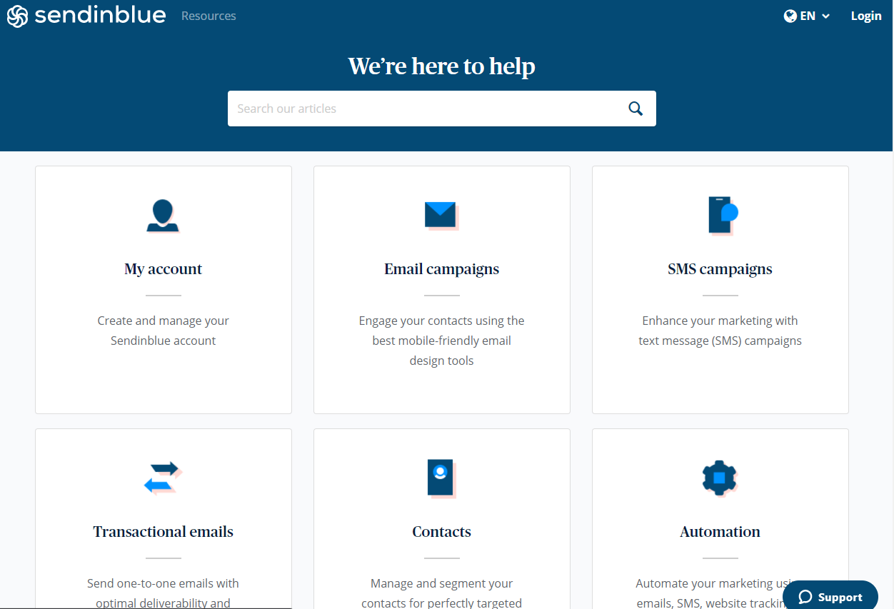 Screenshot from help.sendinblue.com, July 2022
12. FreeSpirit
The FreeSpirit FAQ page combines useful information navigational features with interactive content to empower users to progress through the site and make buying decisions faster.
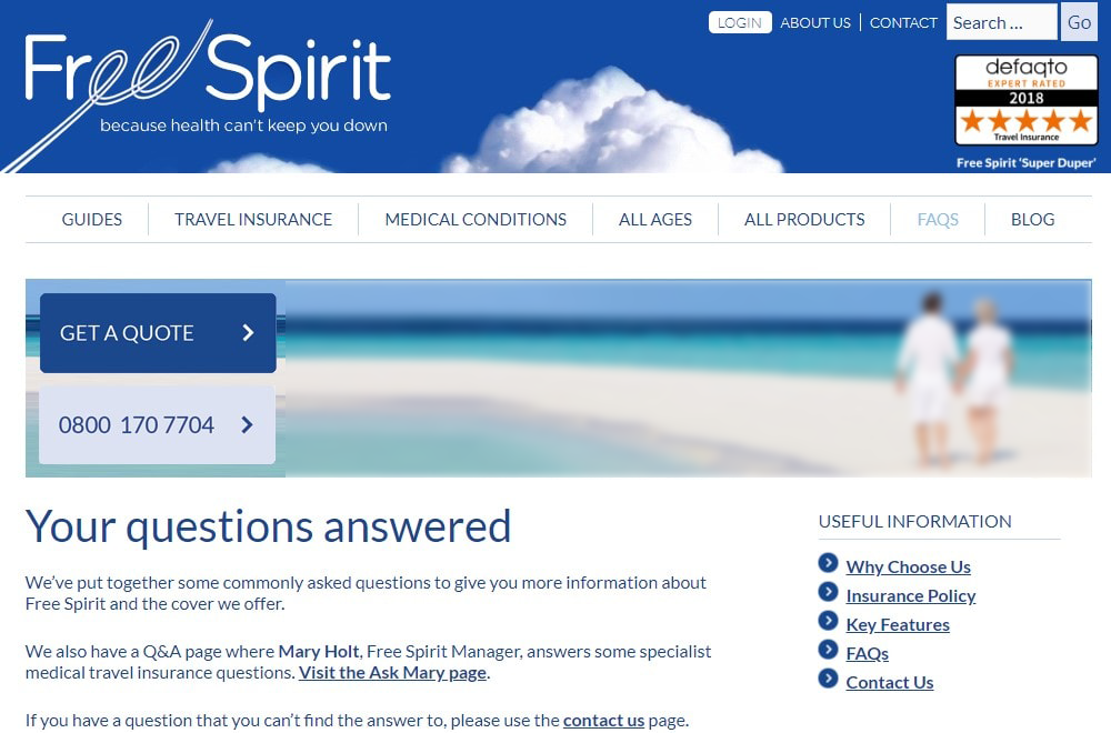 Screenshot from freespirittravelinsurance.com, July 2022
13. Amazon Web Services
Amazon Web Services’ FAQs are functional, easy to skim through, and categorized for use.
There are no frills here.
But, in some cases, it’s better to get straight to the point.
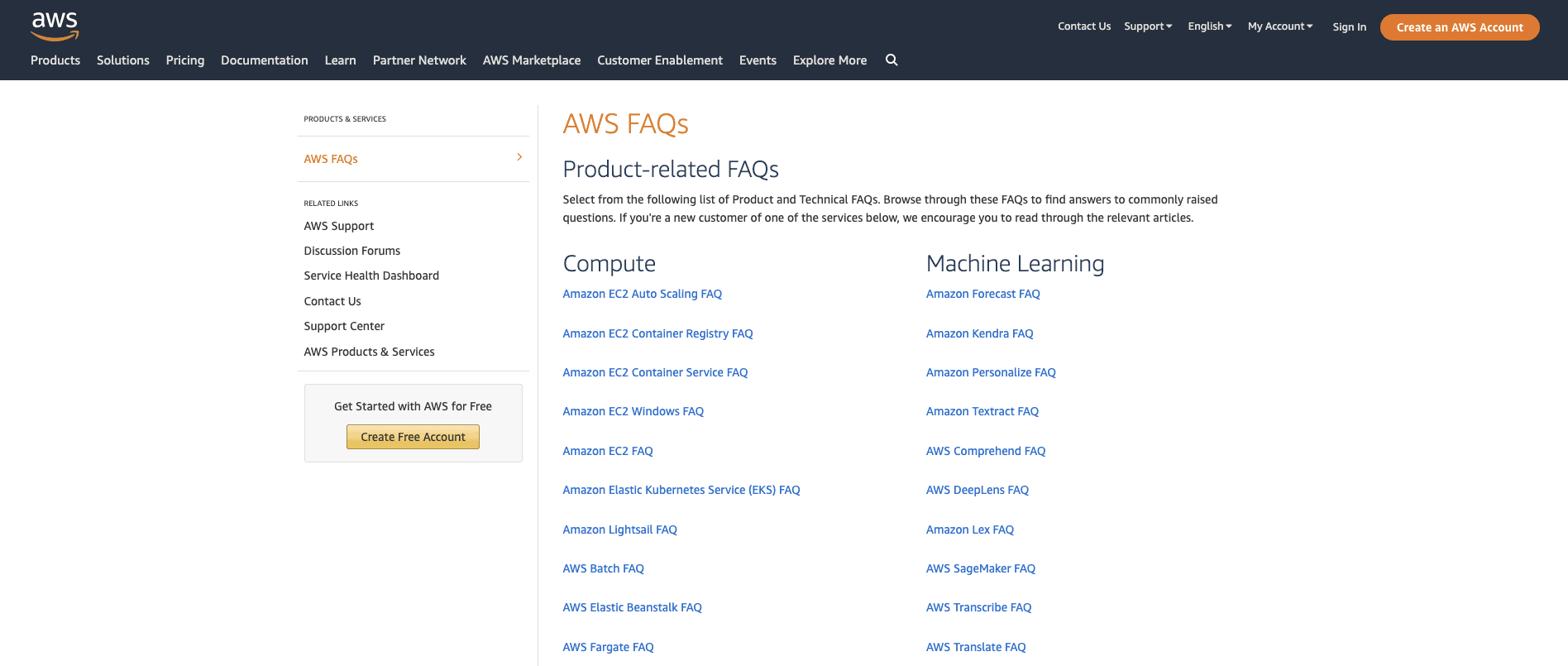 Screenshot from aws.amazon.com, July 2022
14. Silicone Engineering
Silicone Engineering’s FAQs help demystify a traditionally complex industry.
The combination of quick links, ask the expert, and more profound content answers work well for the user regardless of time availability or device used.
Engineering and related industries can seem daunting to many, so this content distillation is always a welcome experience for the user.
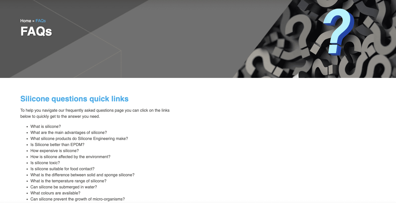 Screenshot from silicone.co.uk, July 2022
15. Dropbox
Dropbox Help brings fun to the FAQ area with the choice of images and encourages the user to experience the site through self-discovery.
It’s a helpful reminder that FAQs can be a fun and engaging way to bring your brand in front of new and existing audiences in various ways.
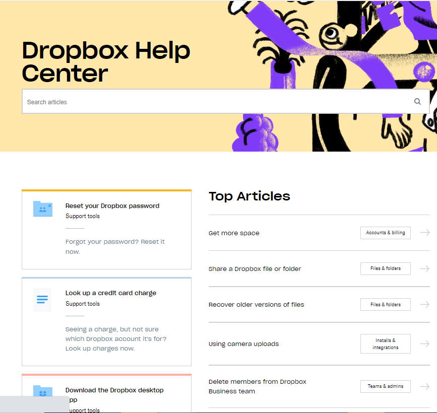 Screenshot from help.dropbox.com, July 2022
16. TUI
TUI FAQs are in a grid format, include depth of topical coverage, and reflect the volumes of information available on the site.
The resource is not overly pretty by design, but it works and almost has a retro feel.
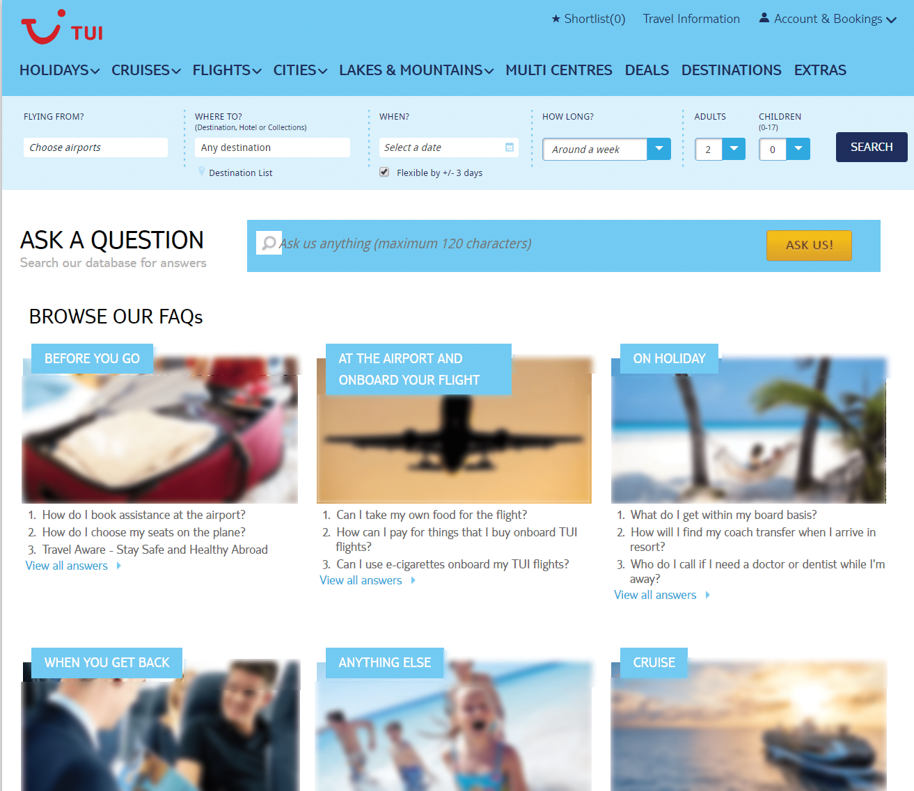 Screenshot from tui.co.uk, July 2022
17. UPS
The UPS Help and Support Centre includes a virtual chat assistant which leverages the FAQs above the static functionality of most.
Chatbots are ideal FAQ considerations mainly based on their ability to expedite and drive the user journey (a key effectiveness area for any help and FAQ resource).
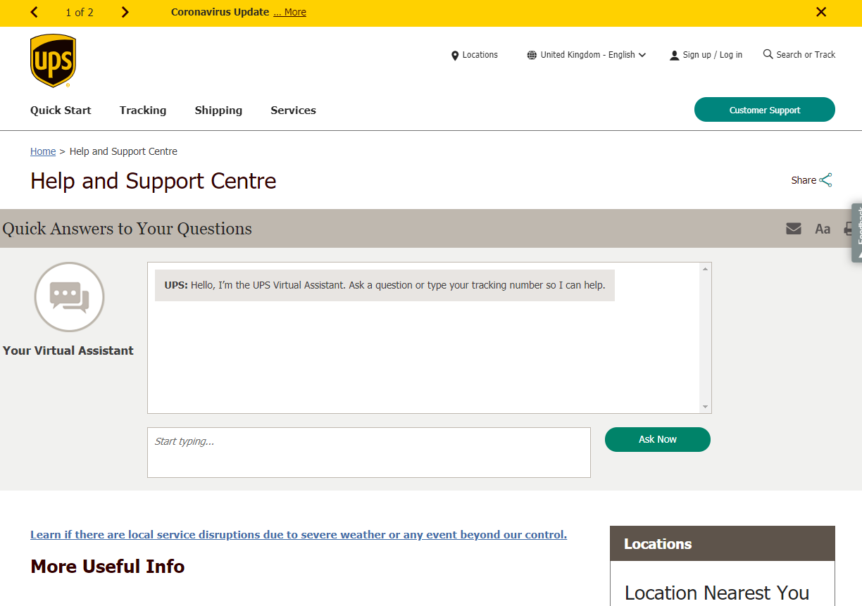 Screenshot from ups.com, July 2022
18. Trent Furniture
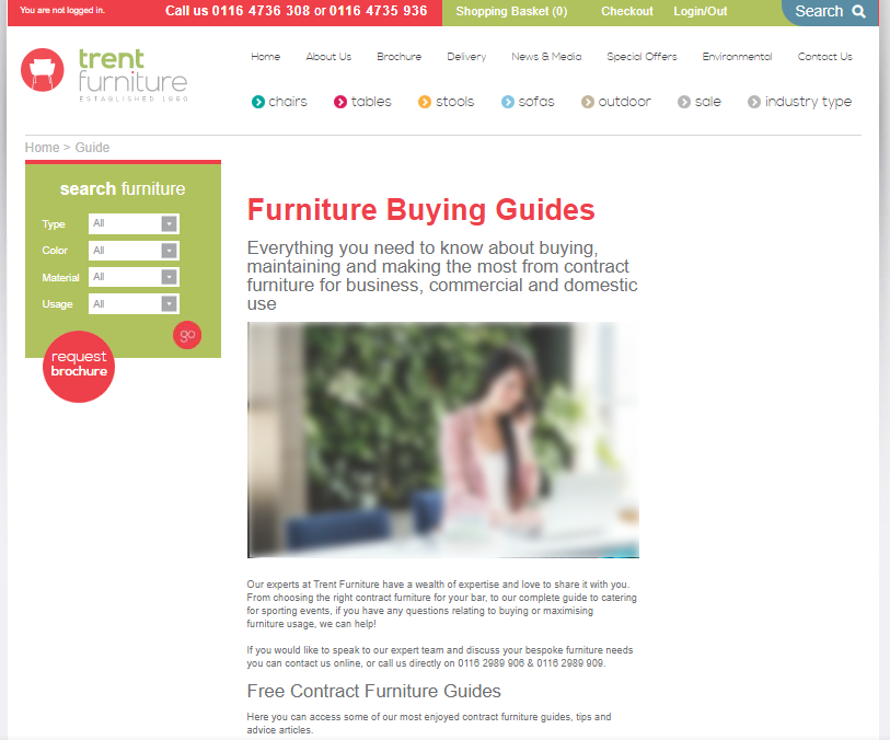
In this example, the Trent Furniture FAQ and guides section acts as both an FAQ resource and a guide roll-up resource.
This means that users can access top-level information, deeper, more comprehensive buying guides, measurement information, and a whole host of other insights normally only accessible through blogs.
For ecommerce sites, it’s positive to access layers of content depth relevant to your buying decisions – whether you intend to purchase in the same session or are working your way through the buying and information-seeking journey.
 Screenshot from trentfurniture.co.uk, July 2022
19. FatFace
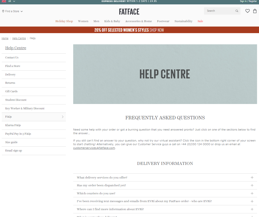
The FatFace help center and FAQs resource is a practical example of a bigger brand getting it right.
The help center places the users first with the topics covered and still manages to feel personable and helpful.
 Screenshot from fatface.com, July 2022
20. Stewarts Law
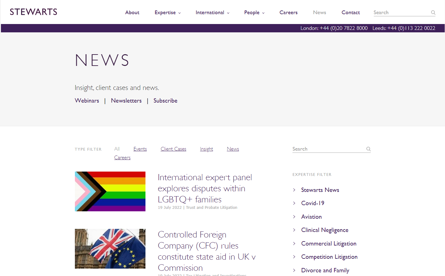
This Stewarts Law FAQs example demonstrates the multipurpose nature of informational content.
This case merges traditional news and article content provision alongside FAQs, insights, and broader expert opinions.
 Screenshot from stewartslaw.com, July 2022
21. Pinterest
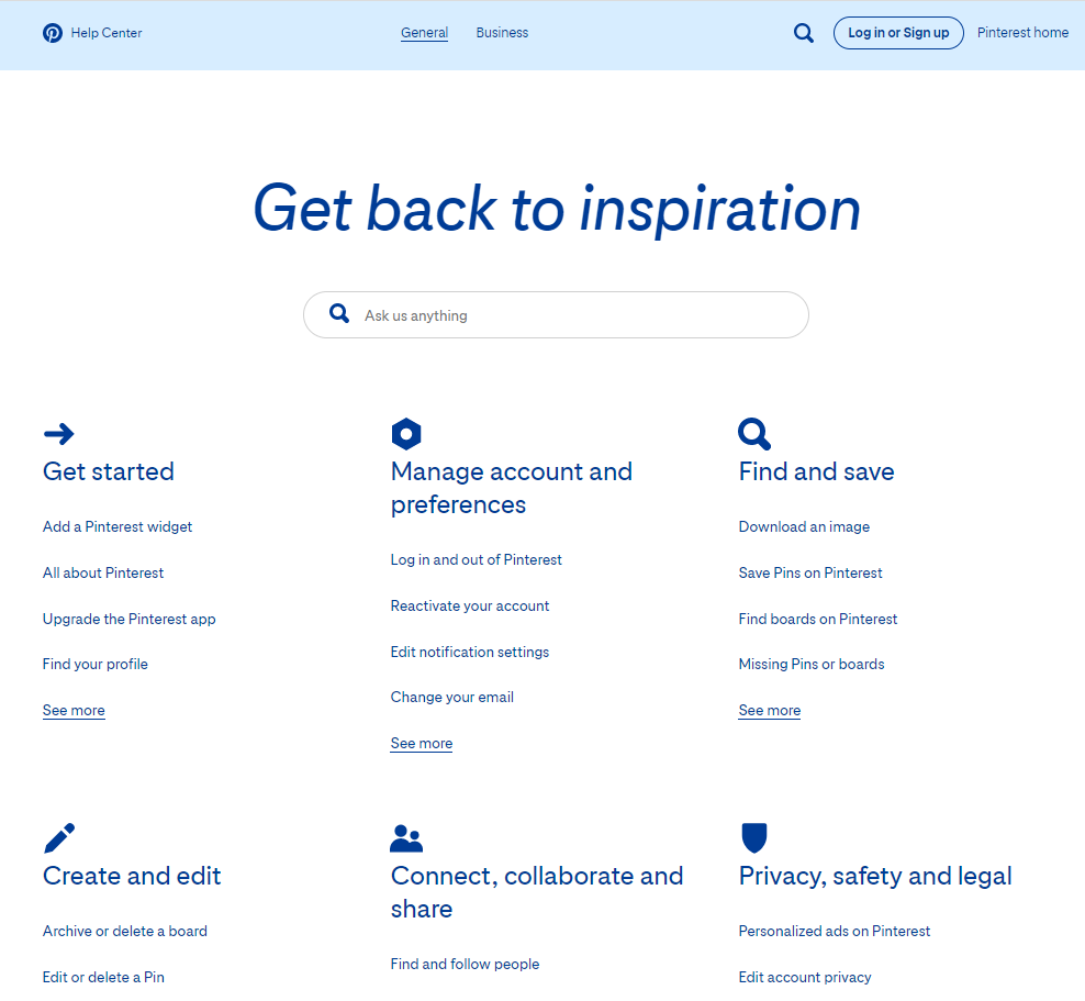
Pinterest’s Help Center takes simplicity to the next level.
The design and information provided are prioritized for the mobile user by combining visual and textual triggers.
FAQ resources should place function first, and that’s clear in this example.
 Screenshot from help.pinterest.com, July 2022
22. Elite Island Holidays UK
The audience’s needs drive Elite Island Holidays’ FAQs and set out to answer people’s holiday dilemmas, from preparation to last-minute help and support.
The blog nature of the answers means that the site visitor doesn’t need to travel beyond the FAQs page for help.
FAQ answers’ completeness can vary by industry and on a site-by-site basis.
In this example, the more profound content provision is good to see and helps prevent multiple clicks or return to search engine query refinement to find a complete answer.
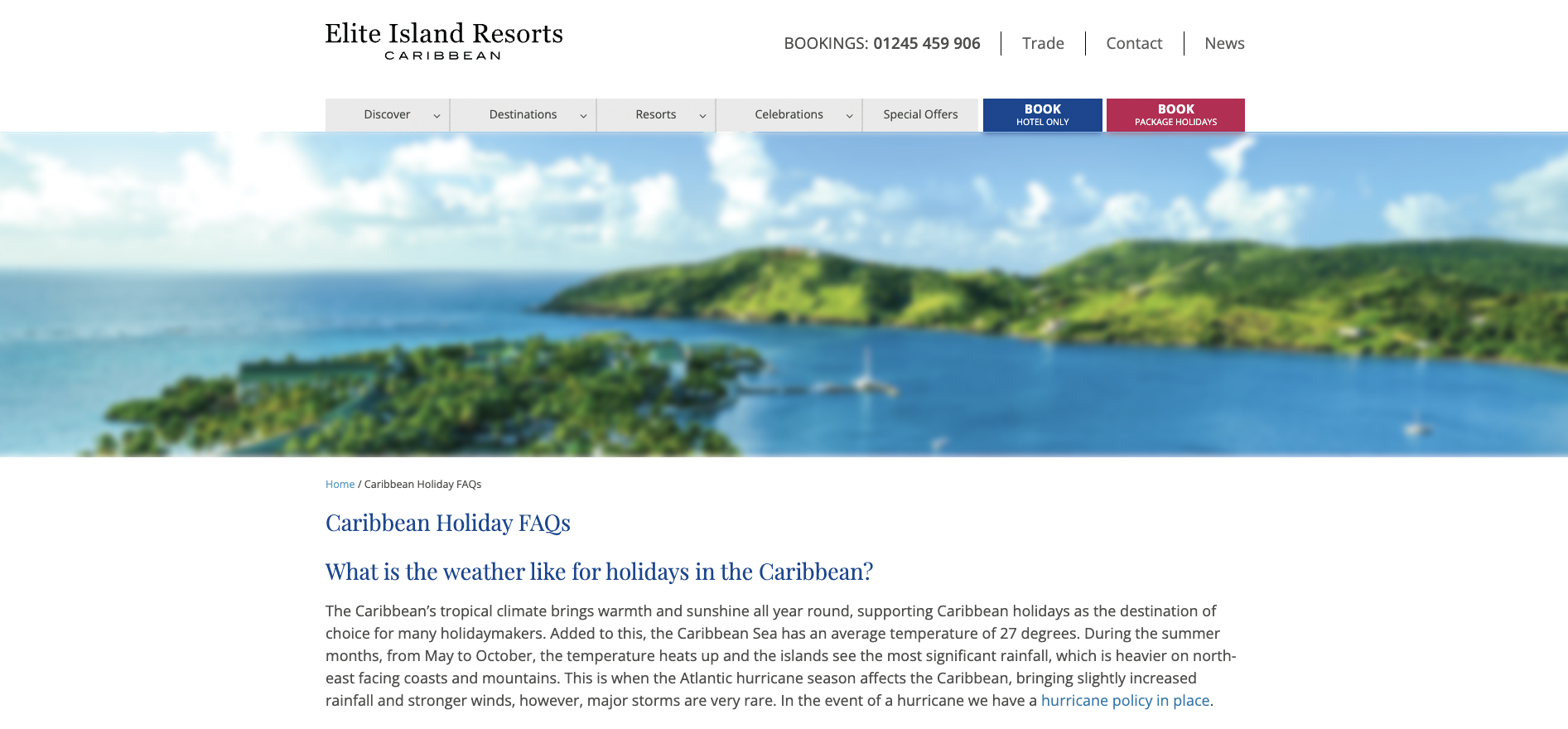 Screenshot from eliteislandholidays.com, July 2022
23. Airtable
Airtable’s Help Center is fun, visually driven, and even provides helpful information on how to use the FAQ section.
Making a help resource fun isn’t easy. However, Airtable has achieved this.
I like to be objective (as much as possible with opinion-based topics like this) and consider FAQ pages that stand out with clear purpose and thought.
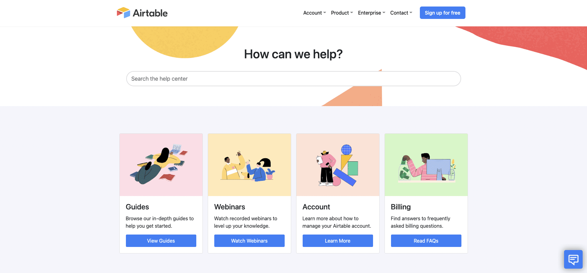 Screenshot from support.airtable.com, July 2022
24. Pretty Little Thing
The FAQs on Pretty Little Thing immediately tell their audience and position the design and content accordingly.
The FAQs also appear well thought out and enticing to interact with.
The clickable visual elements reflect mobile and all device interaction, which is essential for online mobile-first and all device expectations.
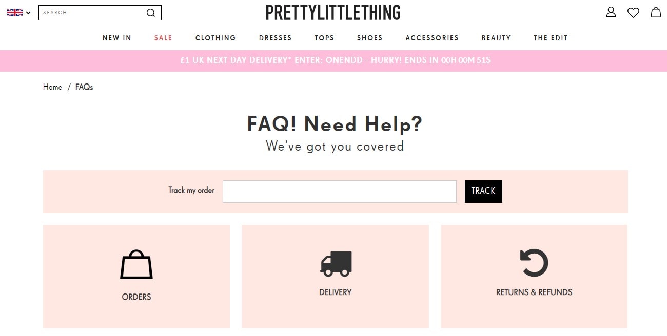 Screenshot from prettylittlething.com, July 2022
25. First Direct
First Direct’s FAQs, Help Center, and Tools/Guide Resource brings many information-rich segmented guides and financial tools into one place.
Making often complex and dry financial topics straightforward and accessible is not easy, but this section does it well.
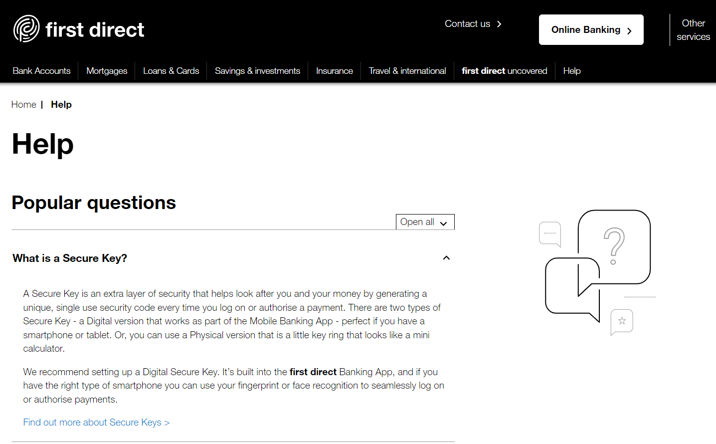 Screenshot from www1.firstdirect.com, July 2022
Creating An Effective FAQ page
Whether you have an FAQ page in place, believe it can contribute more, or are looking to create a new FAQ resource for your website, it’s essential to consider the next steps.
Remember not to overlook the necessity to gather data in your FAQ section. Use this to continue adding to it, refine, and expand the ongoing value provision to your audience.
Your FAQ resource needs to be proactively updated to cater to all the new and ever-changing data sets reflecting your existing and new community requirements, offline and online.
1. Decide On The Purpose Of The FAQ Page
Suppose you wish to bring your experts to the foreground and provide ongoing audience support. In that case, your FAQ hub will function very differently than it would if you intend to increase the ease of access to know cornerstone content on your website.
You need to have a clearly defined FAQ section purpose and ensure you support this with business objectives and KPIs.
This helps maintain prioritization and justification to keep investing resources and focus on FAQ development alongside more traditional commercial website pages.
2. Plan In Advance To Maintain And Grow Your FAQ Hub
Your audience questions will change frequently, and you must ensure that your FAQ content reflects this.
Data within Google Search Console (GSC), on-site search behavior, plus broader industry trends will help inform this.
Don’t limit your data gathering to a single source, however.
Look at the competition, consider Google Rich Results (using tools such as Semrush), and look at the completeness of your expertise provision through your FAQ content.
3. Look Outside Of Your Company Data Environment
While your data is fantastic for servicing your existing customer base, there are often multiple layers of FAQs to fulfill.
You can use free tools such as Answer the Public for more general questions, Google Trends, and competitor sites.
The opportunity to answer In-SERP questions grows all the time. You want to be present in these conversations by showcasing your FAQ content and creating compelling content types to target these items correctly.
4. Structuring FAQs
Both your page and individual FAQs (whether a single FAQ page or entire sections of your site specific to FAQ content) need some consideration on how you structure them and make a lot of varied content accessible for the user and search engines alike.
Consider the expandable on-click text at the individual FAQ level to keep answers clean and easy to use.
At the page structure level, take time to prioritize content based on value and demand, plus technical optimization areas such as the use of schema, page speed, and mobile-friendliness.
Remember that people look to digest content in many ways.
FAQ content does not have to be text only. It’s far broader reaching and valuable to people and for search if it’s multi-tiered and varied in content types.
5. Use Data To Refine & Improve: Part Of ‘Always On’ Focus
FAQ pages quickly become outdated, and their value declines over time.
Make sure you are testing page changes and iteratively improving everything from headings and clickable page elements to new data-led content additions and calls to action.
Every month there will be evidence-led chances to improve, and this mentality is key to maximizing business and user impact.
6. Don’t Forget The People Element
The most successful FAQ pages and help center hubs often stem from a deeper understanding of the people they are intended to help.
Data and evidence are always important, but you must balance this with real-world insights and offline experiences.
The best people to help with this are the front-line staff, who actively engage with your audience daily and truly understand how online and offline FAQs can support and enrich your problem-solving offering.
Your FAQ section supports your staff as much as it’s present to help educate and inform your community.
Think about your recurring conversations and how they can be served equally well online.
Don’t forget mixed content types to replicate the offline experience online, plus the need to gather feedback from your users directly.
As a final quick tip: Every FAQ resource, however complete it may appear, will have new ways to leverage the value received from it and areas to grow.
You can often reposition existing content for new search opportunities, bolster and expand its depth and value, plus create unique visual content from a text-only provision for many short-term and ongoing gains.
More Resources:
Featured Image: Kavaleuskaya Aksana/Shutterstock
