Everyone knows good content needs to serve a purpose. Whether it’s informative, persuasive, or awareness-focused, every word on your website should have a clear goal it’s trying to achieve.
But there’s so much more to the content on your website than just a body copy and/or a flashy video.
Every website also has an unsung hero, playing the Kato to the main content’s Green Hornet, Penny to its Inspector Gadget, Groot to its Star Lord. Of course, we’re talking about the supplemental content.
Not familiar with the term? Don’t worry. Many marketers aren’t.
Google’s Search Quality Raters Guidelines describe it as content that “contributes to a good user experience on the page, but does not directly help the page achieve its purpose. (Supplementary Content) is controlled by webmasters and is an important part of the user experience.”
In other words, it is any content that makes it easier for visitors to use your webpage. It can be navigational buttons, embedded content, header menus, or even user-generated content.
It doesn’t have to add value to your main content or directly serve the page’s purpose, but it should be relevant.
From a pure UX point of view, it’s pretty apparent why supplementary content is essential.
But you may not have considered its role in supporting, promoting, and adding value to your big content.
In this piece, we’ll take a closer look at both big and supplementary content and discuss creative ways you can use the latter to support the former.
What Is Big Content, And Why Is It Valuable?
You don’t have to be from Texas to appreciate bigger sizes. Not only is it great to get extra fries with your combo meal or unleash the power of a huge F250 (current gas prices notwithstanding), but in marketing, bigger is usually better.
You probably already know about big data and how you can use improved technology to target with extreme precision. But are you familiar with big content?
There’s a lot of discussion about what is and isn’t big content, but for our purposes, we’re going to define it as a content format that requires more time and effort to produce than ordinary content.
For our purposes, we will use it for long-form (over 2,000 words) blog posts.
If you’ve been in the blogging business for a while, you’ve probably noticed this number climbing steadily upwards.
Between 2011 and 2015, most blogs were between 991 and 1,111 words per post. By 2019, that had climbed to 1,231-1,351 words.
Wix’s 2022 study offered a more comprehensive range between 1,500 and 2,500, with the sweet spot landing at 2,450.
And, of course, big content isn’t restricted to just blog posts; it also comes in whitepapers, ebooks, case studies, comprehensive guides, and more.
So, we aren’t limiting the definition of long-form content to blogs. Instead, it’s the example we’ll explore in this post because:
- Fresh content is a proven way to drive traffic to your website.
- 90% of marketers used articles and blog posts in their content marketing strategy.
When it comes to long-form content, blogging is where it’s at.
So Why Use Big Content Pieces?
Aligning your content calendar around big content pieces gives your content marketing a campaign-based structure.
It enables you to focus your efforts and resources on one area, maximizing the value of each piece.
The massive value in properly executed big content makes it the ideal foundation on which you can layer supplemental content for the most significant ROI.
Capitalize on this opportunity to outperform competitors. You’re not just competing against other businesses like yours for eyes and attention in the SERPs, though.
You need to outperform every type of publisher – bloggers, news outlets, social content, and more – in SERPs dominated by product listings, videos, and other multimedia content.
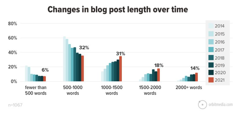
According to Orbit Media, the average blog post in 2021 was 1,416 words, a 75% increase from 2014.
You can see in the chart below that blog posts have been trending towards long-form over the last couple of years.
 Screenshot from orbitmedia.com, July 2022
So let’s be clear: The bar is high. Content needs to be longer than ever to perform optimally.
Now let’s see what all of this looks like in action and how you can use supplemental content to create more substantial and more productive content campaigns of your own.
Embedded Content Enhances Your BIG Content Object
Supplemental content pieces enrich your main content object (the long-form blog post) but are also optimizable and can be shareable.
Lots look at a few types that add to the big piece but also have value on their own.
Mini Graphics & Image Cards
Embedded images help break up the dense text, visually tell your story, and are also helpful in SEO.
For supplemental content, you need to go beyond static photos or stock images to mini graphics or other storytelling aids with as much utility as visual appeal.
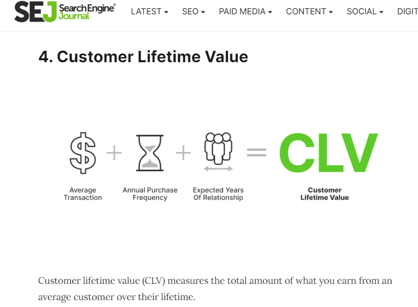
Take this image, for example:
 Screenshot from searchenginejournal.com, July 2022
The graphic adds utility to the larger post, but you could share this directly to Facebook, and it would also stand on its own.
Here’s another example. A juice press brand has created image “cards” as an alternative format for presenting information about healthy city rankings.
 Screenshot from press-london.com, July 2022
In both cases, the author could have presented the information in text-only.
The extra effort it takes to create images as supplemental content gives you an entirely new shareable piece of content to share on social media and help expand your blog’s footprint in the SERPs (via Image Search results and images that Google pulls into regular SERPs).
It’s fairly easy to resize these images for optimal display on various networks.
Using Photoshop or Canva, you can resize your images for Facebook (940 x 788 px), Instagram (1080 x 1080 px), Twitter (1024 x 512 px), and more.
Don’t forget to add them to your Google Business Profile albums.
Check out 12 Important Image Tips You Need to Know for more on image optimization.
Embedded Social Posts
Adding posts from Instagram, Facebook or Twitter is an easy way to add an element of interactivity and visual interest to your long-form blog content.
Embedding your own post rather than a static image promotes your Instagram presence to your blog readers, as in this example from our own Instagram:
Or embed posts from others to provide social validation of a point you’re making, cite them as a source of information, etc.
Embedded Video
YouTube is the second most-visited website, with users spending an average of 23.7 hours per month on the platform.
You don’t need a huge production budget to publish YouTube-worthy videos, either.
Authentic videos tend to resonate better with YouTube audiences than commercial productions.
 Screenshot from search for [exercise ball], Google, July 2022
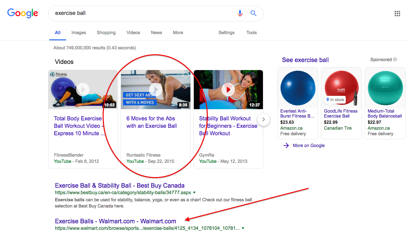
In addition to the amazing content they bring to your blog, YouTube videos can dramatically improve your visibility in search.
How else would a smaller business like Runtastic (a running coach and certified fitness trainer) dominate Walmart in the SERPs as in the above example?
Calls To Action As Supplemental Content
Maybe your reader is really into the content and wants to read or skim to the end before deciding on their next step.
But maybe not.
Always give your audience the option to take the next logical step. Using buttons rather than plain text makes your CTA an appealing element that helps break up the text.
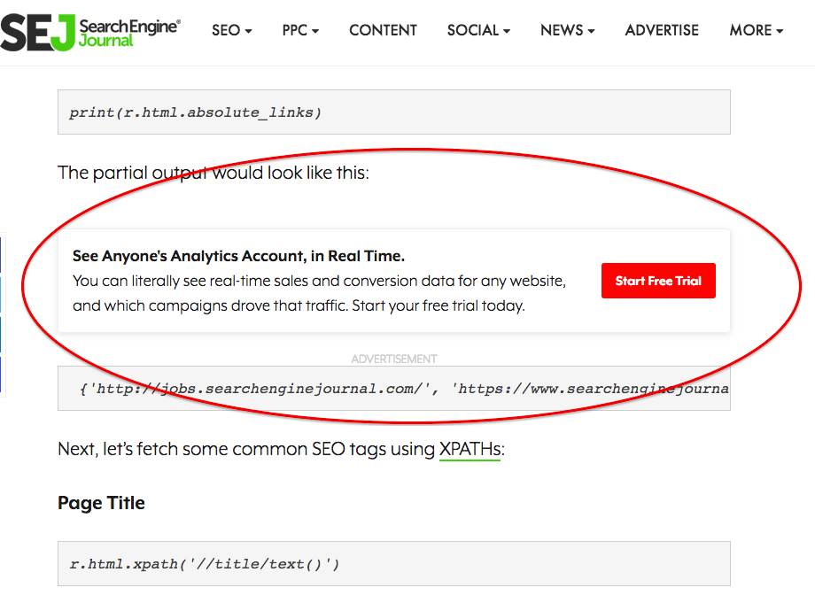
You can even design your own “ads” to run inside your content. Think of what external ads inside blog content look like:
 Screenshot from searchenginejournal.com, July 2022
Like the example above from here at SEJ, ads inside your content are a valuable commodity because they work.
But if you’re running a business, you don’t want to look spammy or send traffic to someone else.
Use this space and apply the same design principles to drive traffic to your own content, products/services, or offers. Use it to give visitors the option of taking that next step if they’re ready.
You don’t want to spam your visitors; instead, use this space to offer utility and added value.
Complementary Content That Supports Your Big Content
This is the content that appears elsewhere on the page. Think in terms of the overall user experience you’re offering:
- If I like the content in the larger piece, is there a clear next step I can take without having to look for it?
- Does everything on this page support me in my journey of making a decision and taking action?
- Does all page content speak directly to my needs?
What’s In Your Sidebar?
On the desktop, your sidebar is a valuable piece of real estate. Are you using it to support users in taking their next steps?
Use your sidebar to feature a lead generation piece that will help the reader access more in-depth information, even as they self-identify you as a certain type of buyer.
 Screenshot from searchenginejournal.com, July 2022
Anything you put in the sidebar appears on every blog page, so make it good. There are the basics you don’t want to overlook: search functionality, RSS feed subscription, and links to your social media accounts.
Then consider a few other intelligent ways to make use of this space:
- A (very) short tagline or another critical brand message.
- For ecommerce sites, key conversion elements like your shipping options or product guarantee.
- Featured content: your most popular or highest converting pieces.
- Any lead generation offers (a free trial, demo, etc.).
- Upcoming webinars or other events that give users a chance to interact.
(Sidebar content might appear below your larger content piece for mobile users. This is why the embedded calls to action we looked at above are more important than ever.)
Pop-Ups
The misuse and abuse of pop-ups has given them a bit of a bad rap, but that shouldn’t keep you from using them to supplement your best content.
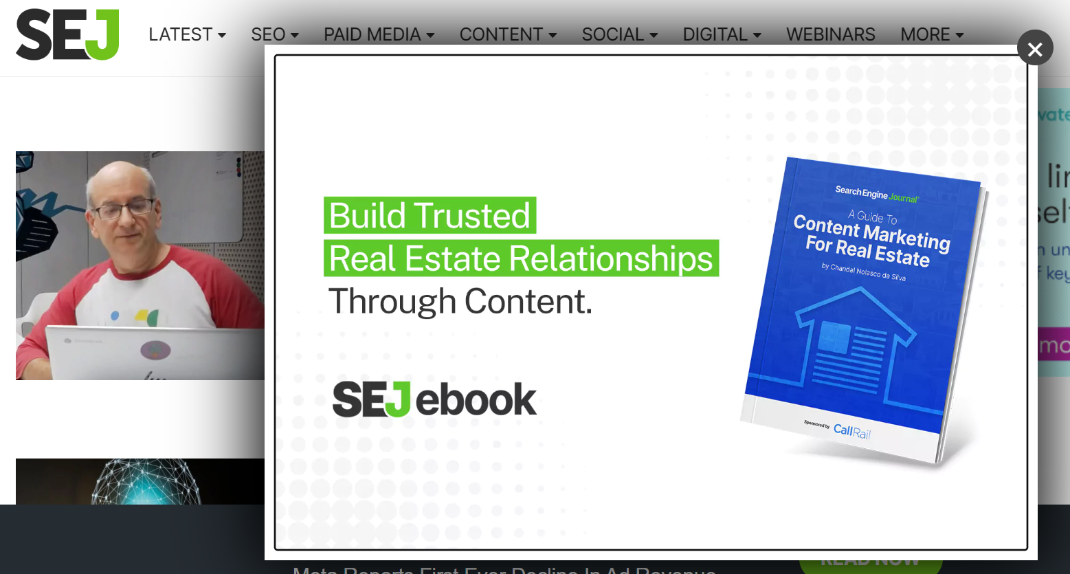 Screenshot from searchenginejournal.com, July 2022
Again, it’s all about adding value for your audience and using supplemental content to help them in discovery, decision-making, and taking the next steps.
Making It All Work Together
The point we’ve been trying to make should be clear by now. I mean, it’s in the name: supplemental, meaning “provided in addition to what is already present or available to complete or enhance it.”
In other words, your supplemental content should work hand-in-hand with your main content, with each piece corresponding to a specific need and pushing the customer another step forward in the sales and marketing funnel.
Of course, this is why we suggested you use a campaign-based structure way back in beginning.
By planning ahead and having a shared vision of what you want to accomplish, you can create pieces that complement each other, instead of trying to create a cohesive narrative around a bunch of disparate pieces.
In addition to moving your visitors along the customer journey and keeping everything focused on your goals and allows you to extend the lifespan of your big content pieces, sometimes by months.
By adding utility and interactivity to your main content, supplemental content helps you appeal to different types of visitors without muddying the waters of what you want the piece to accomplish.
Wherever that content appears on your website, you are looking at the big picture: How each element that user sees and interacts with supports their goals and your business goals as a result.
In this way, you might extend the life of a single concept – one large content object – by months.
You’ll significantly improve its efficacy, and most importantly, you’ll have content tailored to appeal to different types of consumers in their discovery, consideration, and conversion decision-making moments.
Questions? Fire away or share your own content planning tips in the comments.
Enhance the power of your main content by leveraging supplemental content to add interactivity, support the customer journey, and drive action.
More Resources:
Featured Image: ViDI Studio/Shutterstock
